For years, Awesome Art We’ve Found Around The Net has been about two things only – awesome art and the artists that create it. With that in mind, we thought why not take the first week of the month to showcase these awesome artists even more? Welcome to “Awesome Artist We’ve Found Around The Net.” In this column, we are focusing on one artist and the awesome art that they create, whether they be amateur, up and coming, or well established. The goal is to uncover these artists so even more people become familiar with them. We ask these artists a few questions to see their origins, influences, and more. If you are an awesome artist or know someone that should be featured, feel free to contact me at any time at [email protected].This month we are very pleased to bring you the awesome art of…
Thomas Hodge
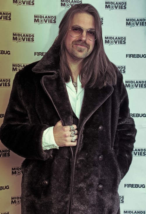
JOBLO: What got you started as an artist?
TOM: All of my work is a labor of love that came from growing up in the UK during the video rental boom of the 1980s. I remember the excitement as a kid of going down to the local video shop and looking at all the box art to choose a film for the weekend. I collected the “sample” video covers and posters from the local Video shop and used to make my own covers for the films I recorded off of TV.
That period left an indelible mark and a love for this particular form of pulpy art style, these salacious pictures of terrifying creatures, sexy women and muscle bound men. The UK (and Europe) seemed to have more of a leaning towards illustrated cover art on tapes. In the UK it was especially due to the issues that arose around censorship and even the covers had to be rated by the VPRC (Video Packaging Review Committee). So you could get away with a lot more in an illustrated image than you could in a photo, because it was considered as more explicit and offensive!
However, illustrated film art went out of favour around the mid-1990s, when VHS tapes were replaced by DVDs and censorship became much more liberal. So either for matters of expediency or fashion, cover art became photoshop-based, with some terrible early photo manipulation and even utilitarian at times (just look at these comparisons!).
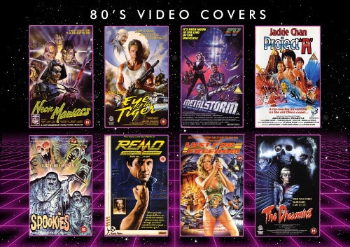
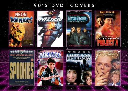
Film posters suffered similarly with the end of the National Screen Service, which was in charge of all commissioning, printing, and distribution of film poster art in America from 1940 until the 1980s. The NSS favoured illustrated art and after they closed down, film posters were brought in house by the studios and sadly the infamous fashion for big floating heads came into play in the mid 90s. If anyone remembers the old Funny or Die sketch.
So as I went though College and University there just wasn’t any merit seen in film art and it all faded into the background for me. Fast forward to around 2009 and I was working as a designer at Sony PlayStation. I was moving in more arty circles and wanting to produce something more art based. I have always been a hoarder of imagery, and when surfing the web one day (like people used to before it all became about social media) I stumbled upon an old website with all these old video covers on it, and it just rekindled this flame. I wanted to create pictures like these! This was my original inspiration which led me to a career in Graphic Design.
As a result, I began experimenting with photography, graphics, and illustration to create my own video covers and film posters. I created “The Dude Designs” with a simple blog (I really miss the Blogspot days!) to start showing my own artwork online, something I had never done before, and people started to genuinely express interest. “The Dude Designs” was a creative outlet with a mission to return to the true spirit of illustrated movie poster art, the style, expression, and characteristics that I perceived as intrinsic to this art “movement” in its own right. “Film art” is so prevalent now that it all seems like second nature again, so it’s hard to look back on it all in the context of the times (2009) but I really was feeling blind rediscovering the quintessential VHS and classic illustrated art style.
There was a growing trend for screen print poster art with Mondo, and I can think of a handful of people who were also creating illustrated film art; you had Stephen Romano with his great book Shock Festival, Rick Melton was doing the early Arrow Video covers and Garry Pullin was at Horror Hound. Largely the big trend at the time though was for super minimal poster art but I wanted to capture what I saw as the quintessential classic illustrated film art and create fun chaos over the top imagery like I remembered seeing and loving back in the video store days!
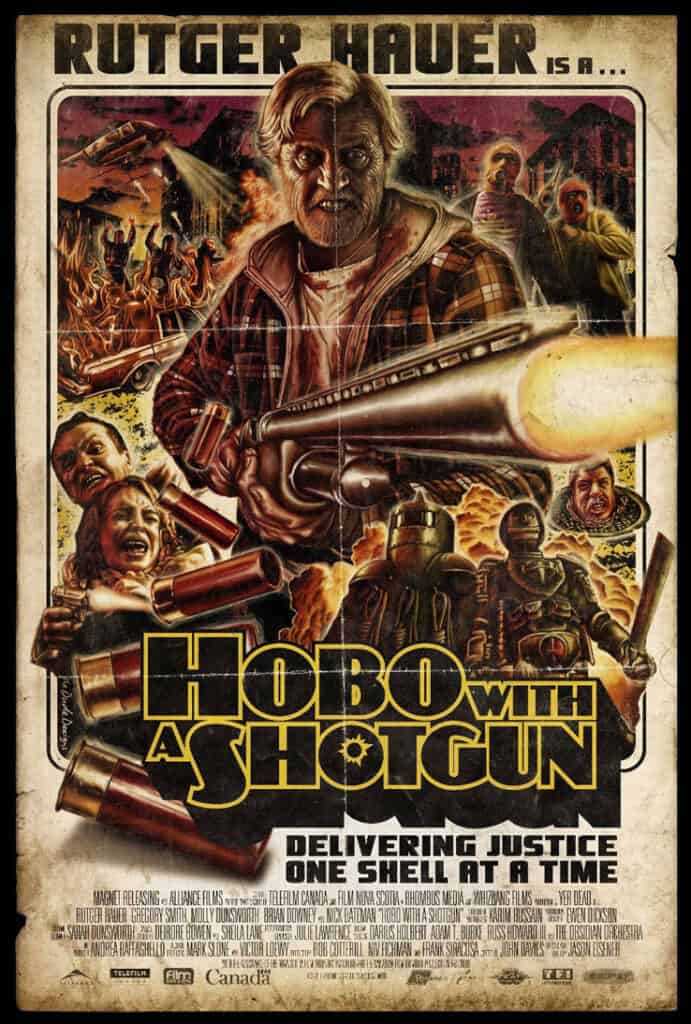
I started to pick up a few cover art jobs on the side, through the blogspot but then in 2010 I saw the Trailer to Hobo with a Shotgun and thought it was a perfect fit for what I was trying to do. So I reached out to the director Jason Eisener and said would you be interested in a film poster, they said sure love to see what you can do… so off I went and “on spec” created the poster art. Looking back, there were no guarantees that they would see it as anything other than fan art. I just worked like mad and wanted to make something that would epitome this style and also hopefully blow them away – and it did! They loved it and Jason said “It almost put me in a car crash, I was so impressed, I couldn’t take my eyes off it”
My keyart was then used as the main release art world wide and I’m still proud that when I did Mondo con in 2015, Mondo cited me as a key figure in the world of modern movie poster art, “being instrumental in the resurgence of the ‘old school’ poster art aesthetic with the release of Hobo with a Shotgun” which they termed “Game Changing”.
Who were some of your favorite artists growing up?
At the time, I never knew the names of a lot of the artists on all these old video covers and posters.
Renato Casaro and Enzo Sciotti were the true kings for the style of this sort of salacious imagery I talk about. Not to detract from their art though, they were amazing fine art painters in their own right. Casaro actually did the German poster art for the release of Dances With Wolves.
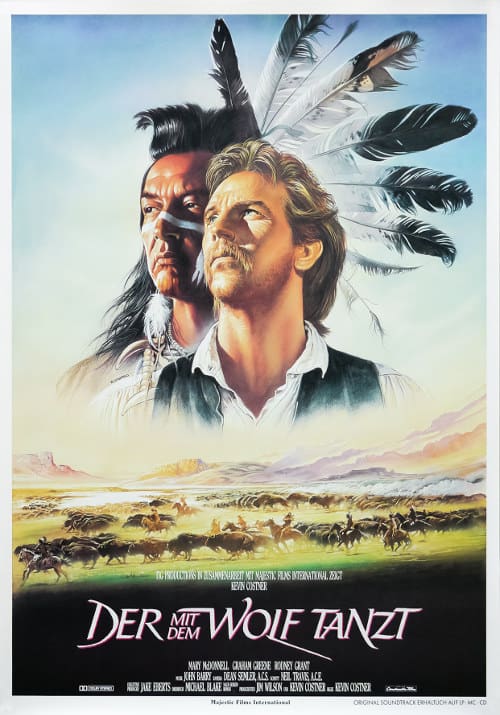
I do remember being particularly obsessed with the cover for a tape of Return of the Living Dead which I pulled out of the Ex-Rental bargain bin at the video shop. I loved Night of the Living Dead so this was a wow moment!
I only found out years later the artist was Graham Humpherys who everyone knows now, he did the art to A Nightmare on Elm St and Evil Dead too.–>Living Dead poster
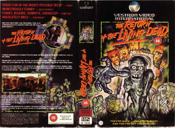
I loved Grahams painting technique, on ROTLD it had these real thick, coarse brush marks, particularly on the zombies clambering out of the ground in the background elements. It was different to the more tight style of Enzo Sciotti and Renato Casaro. I loved it that much it inspired my final school art project for which the art teacher then failed me on!
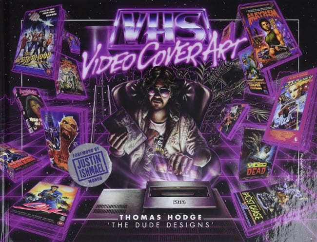
So this is why I did the book VHS: Video Cover Art. To showcase all these great old video cover art and the artists behind them.
Who do you really dig these days, follow on Instagram?
I think like a lot of visual artists, we find social media to be increasingly depressing these days. Its all so over saturated its hard to see the wood for the trees. Social media art has such fast turnover. They changed the algorithm of Instagram in 2022 (I think!) and ever since I’ve seen it’s become increasingly difficult for people to get their art noticed (as do I), especially with A.I. now entering the arena and turning out so much content. What can you do? The internet IS social media platforms now really, that’s how people consume visual information.
So do I tend to look a lot to older artists generally, it’s part of my style of art really and I also find it helps to turn off the noise of “whats new” and just see what I choose and even after a decade there’s still always someone new to discover. More recently I’ve looked towards the art of Sandro Symeoni and Raymond Elseviers. I love the heavy brush mark technique which is so expressive. They can capture a character in these great broad brush strokes. With just a few chunky paint marks they can create a intense facial expressions.
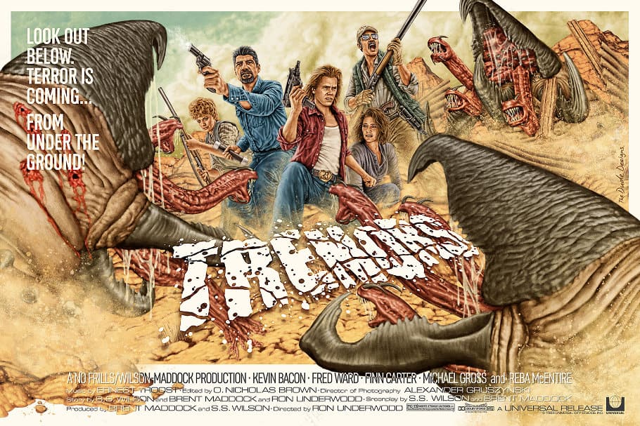
Frank McCarthy Is another one who I knew of, but when I worked on my Tremors screen print, I wanted to do it in a classic western film poster art style and who better to look at! So I really got to study him, his style, composition and his technique. It’s part of the fun of getting to do this type of art for me, getting to really explore different classic artists work. I still feel I’m back at uni in a way, constantly researching and learning.
What advice would you have for budding artists today?
Oh that’s a doozy! It’s a changing market and a hard time for ‘artists’ I feel. With the cost of living rising it’s more difficult than ever to make a livelihood from the creative industries. As previously mentioned, it’s becoming increasingly tough to be discovered online, and now add in A.I., which is going to fundamentally disrupt the landscape in ways I don’t believe people realize yet. My feelings go out to anyone attempting to start out and make a go of it right now.
All I would be able to say from my experience is to not look to what is trendy now. Look to what first inspired you creatively, what really gave you that creative buzz and tap into that to find your inner creative voice, that inner creative geiger counter which guides you, even if others don’t get it.
But aside from any creative advice, mental health is really important. There are particularly significant correlations between creativity and mental problems. This can be really compounded when you are then dropped into being a freelance creative. It is a very insular job, you work long solo hours and you have to don so many hats to run a business, be creative and manage self promotion.
I’ve really struggled this year mentally. I’ve had some setbacks (as well as personal family matters). A client I felt I had built a good relationship with who I won’t name, went from telling me how much they love my work and working together, planning to work on other new projects (as well as covers) booked in multiple jobs for the year, then just suddenly stopped communicating with me, and I really do not know what has happened. I’ve had to watch pieces that I was supposed to be producing done by someone else and I don’t know why. I can’t get any closure on that and it builds a lot of self doubt. Not to mention the stress and destabilising impact of losing a steady source of income when you need it most to support your family and children.
So it’s stressful and hard, which is why it’s crucial you look after your mental health. Try to ignore or turn off the negativity of what people spout online. It’s one of the hardest things to take on when putting creative stuff out into the ether of the web when you are scraping by and people insult you or trolls revel in your misfortune. I’ve had some crazy stuff throw at me, I’ve even had death threats and all – just for creating an image! It’s insane.
This industry can be very tough on your mental health, especially when your art is so personal and intertwined with who you are.
That’s why you have to have this passion for what you create. You take on the stress of creating art and dealing with your own inside critic as well trying to make a living and even support a family. It’s a small thing but what helps me is to get stuff around you that you love, play music, or have a film on in the background etc. Surround yourself with what you love about creativity, what will inspire and motivate you.
Try not to focus too much on likes and followers. I know that’s hard but it can really drag you down and it really doesn’t account for much. For example, I’ve probably got the some of the lowest follower numbers on Instagram amongst my peers and for an artist who’s being doing this for over a decade now… But here I am, chosen as artist of the month.
Focus on you and the joy of creating what you create, because creativity and being able to be creative, to build something from an idea and execute that by your hand is a precious and rewarding thing. Theres a good Gandhi quote I came across the other day “It’s the action, not the fruit of the action, that’s important.”
I’m quite approachable and happy to chat with any artist struggling with that side of things. Poor mental health in the arts is a big thing sadly.
What should we be looking out for from you in the future?
Who knows! Like I say its a changing market so I’m unsure how things are going to turn out in 2024.
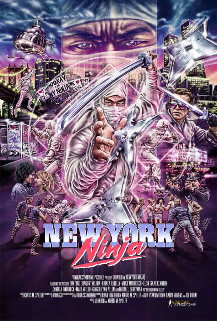
I’ve been lucky enough to do a lot of work for Visual Vengeance who are a lovely label to work for, I’m still eagerly awaiting a lost cult martial arts title which I worked on last year being released. It will make a great companion to NY Ninja and Miami Connection that I was also fortunate enough to work on.
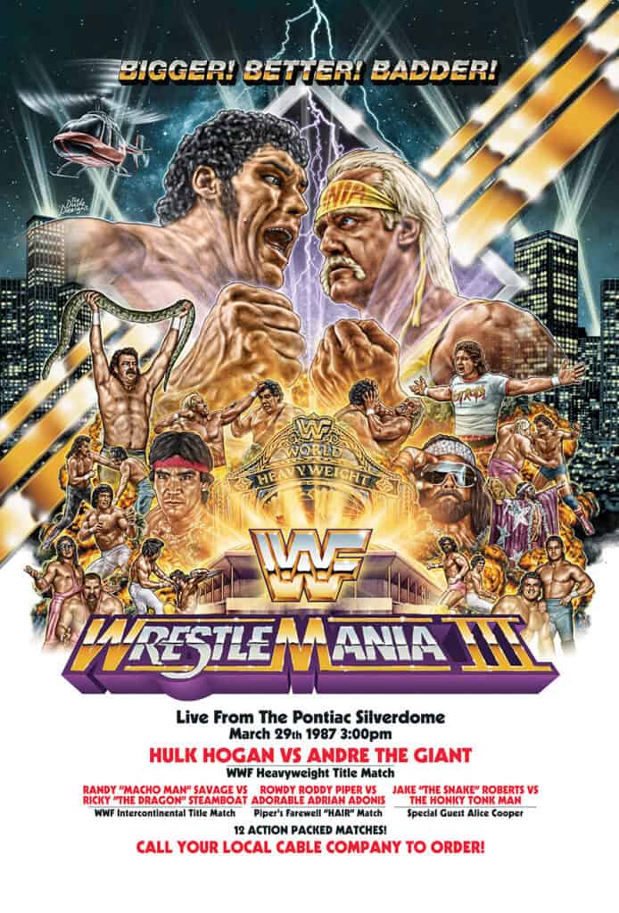
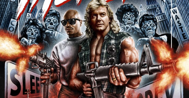
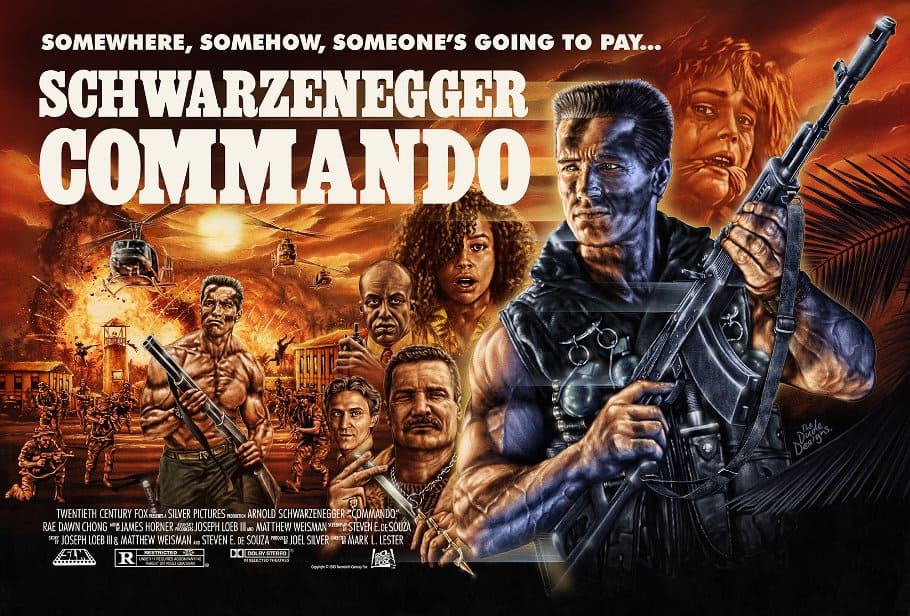
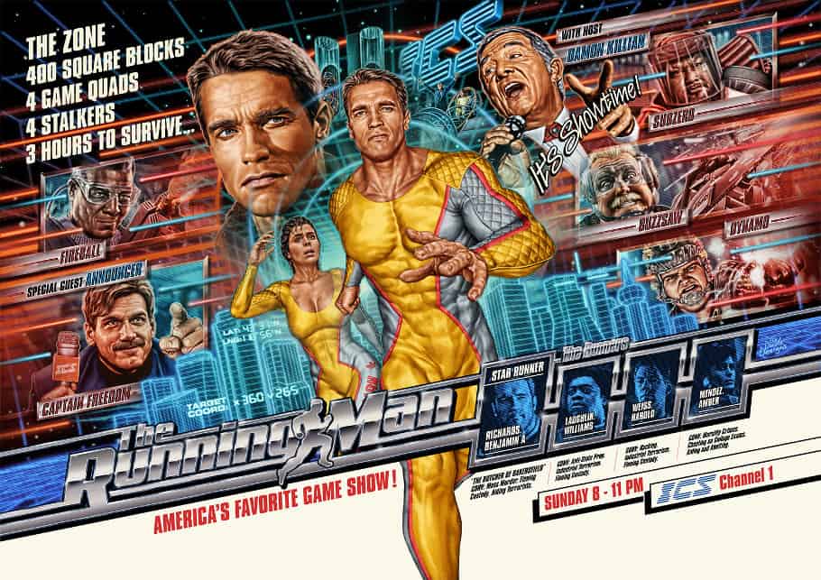
I have also been doing some private commissions for big screen print pieces, which is a great opportunity to to tackle some big classic titles like Commando, The Running Man and Tremors as well as good old WWF WrestleMania III, and to get paid for doing it!
I am also working on a book of my own collected works, going though the old files, and collecting concepts for stuff people haven’t ever seen. Everything is so small on phone screens you miss a lot of the real detail, so these full page images will really showcase the intricate details and some hidden elements. Having been doing this for over a decade now I have a lot of pieces so it’s good to get it all together.
I’d also like to have it for my daughter who’s 3, to be able to see what daddy did years from now. Unfortunately for reasons I won’t get into I’m now in the process of looking for a new publisher so if anyones interested or knows any publishers, please do drop me a line!
Being a fansite, we have to ask you… What are some of your favorite movies/TV shows of all time?
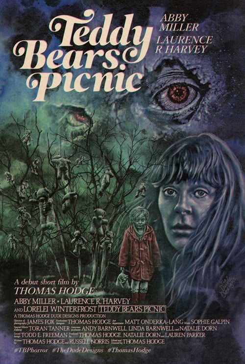
Well I’ll take the time to plug my own short which was “the original” Teddy Bears Picnic I made back in 2017, I say the original as another one was made after and was on Crypt TV so it more people has seen/know that, it’s starring Abby Miller (Justified and The Sinner) and Laurence R Harvey (Human Centipede 2&3). It actually a proof of concept short for a feature film version. You can watch the short HERE.
I do collect a lot of films, I have a few VHS (to say the least) but had to stop now as they just became to expensive.
But if you want some lesser known Videos (after talking about VHS so much)
Boneyard (1991) Great creature FX probably way better than the film deserves to be honest, genuinely creepy zombie kids and a HUGE mutant poodle, what more could you want!
Neon Maniacs (1986) because I always mention it, its a bit messy but super cheesy 80s horror.
The Vagrant (1992) Quite a lesser known Bill Paxton film, not cheesy or ironically funny just a really good one!
Twice Dead (1988) Grandmothers House (1988) and Pulse (1988) are other quintessential classic horror films i recommend renting from your local video store!
Video tapes aside, I did get myself a projector a few years back now and I can’t recommend one enough. I love being able to stick a movie on the “big” screen at home, so I’ve gotten more into big cinematic films.
Alien (1979), The Thing (1982) and Smokey and the Bandit (1977) are all time my favourites.
Then stuff like Death Wish 3 (1985) is just pure cheesy fun. Point Blank (1967) with Lee Marvin is just visual perfection. Phase IV (1974) Saul Bass (legendary graphic designer behind a lot of Alfred Hitchock’s stuff) It’s a trippy sci-fi film which takes the B-Movie concept of killer ants taking over the world but treats it in a really serious and creative manner.
More recently I find myself drawn to more obscure surreal films, like Kin-dza-dza! (1986) Soviet sci-fi/Comedy, it’s amazing and i recommend everyone see it. It is a cult film but not known so much outside of Russia. Plus you will learn a whole new word “Koo”.
Fellini’s Casanova (1976) is a trip It looks like rally looks like all the AI generated films people post now. Donald Sutherland sails on an ocean of black plastic bags at one point and he had his teeth shaved down to play the part!
And Finally Cory McAbee’s (who is an incredible multi talented artist and musician) film An American Astronaut (2001) It’s another wonderfully surreal sci-fi/comedy/musical by way of David Lynch’s Eraserhead almost. It really is brilliant and I don’t think it has ever had a blu-ray release still.
Scroll down to check out some of our favorite art pieces from Tom as we continue to follow his journey across his Website and social media hubs: Instagram / X / Facebook / Threads / Blog / Print Store / Video Store Staff Cothing Store / Kung-Fu Clothing Store
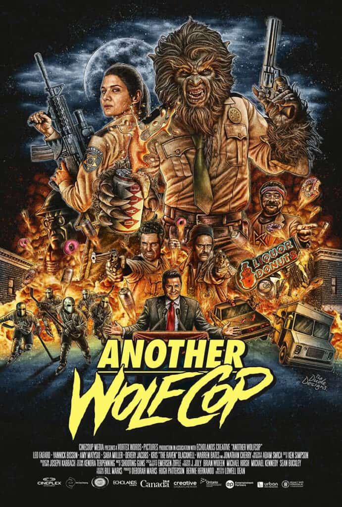
Another Wolfcop
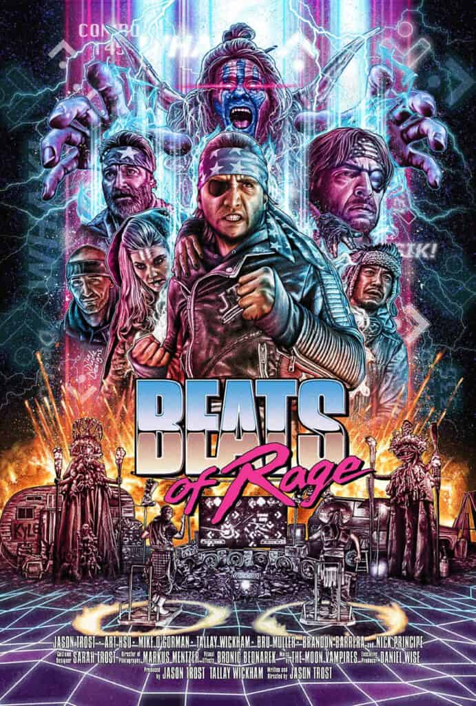
Beats Of Rage
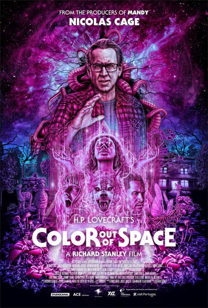
Color Out Of Space
Commando
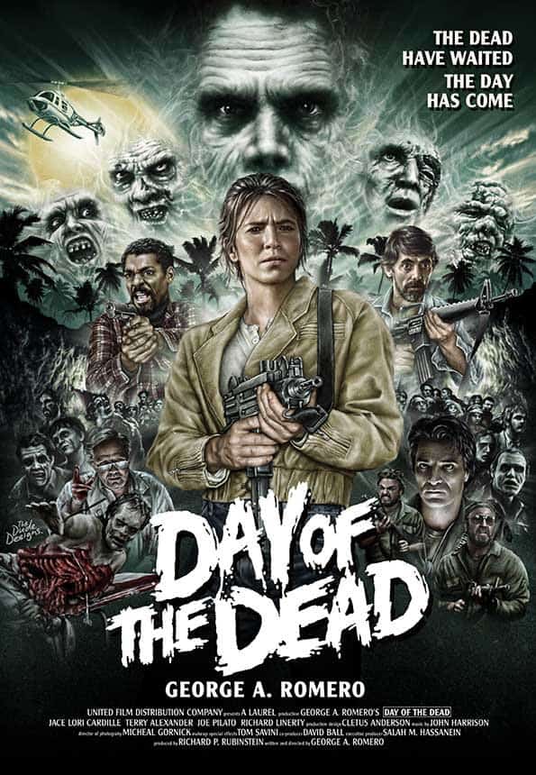
Day Of The Dead
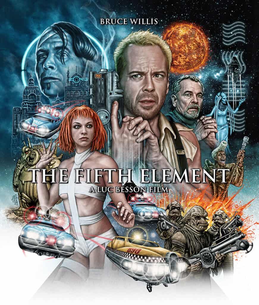
The Fifth Element
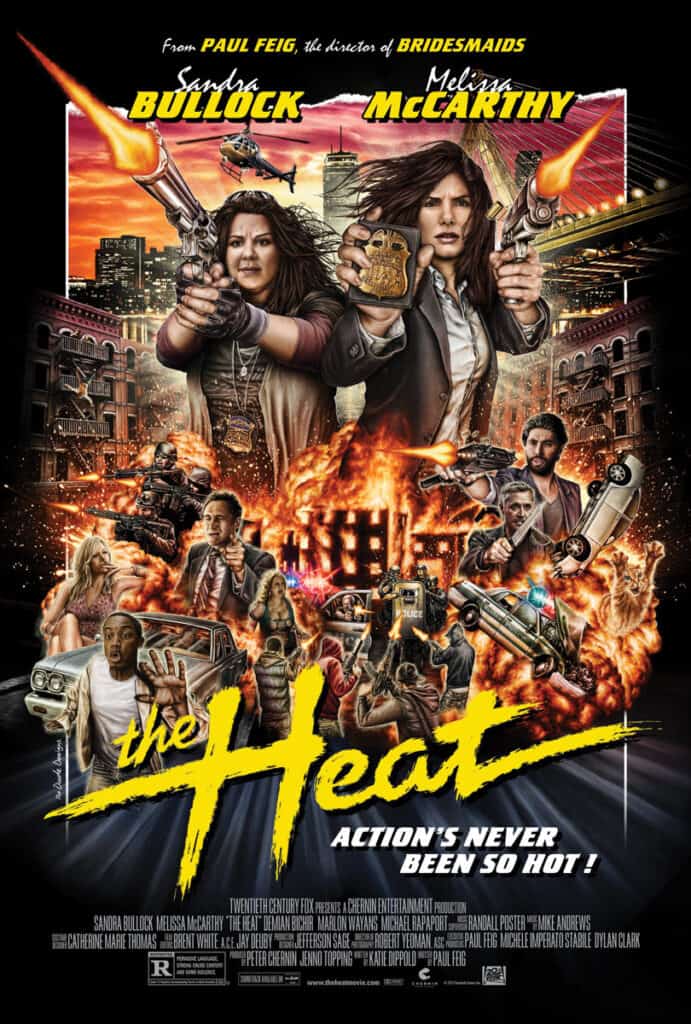
The Heat
Hobo With A Shotgun
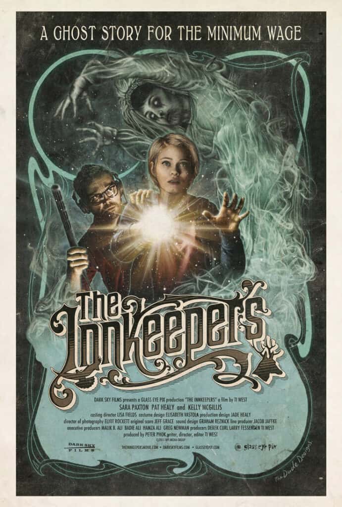
The Innkeepers
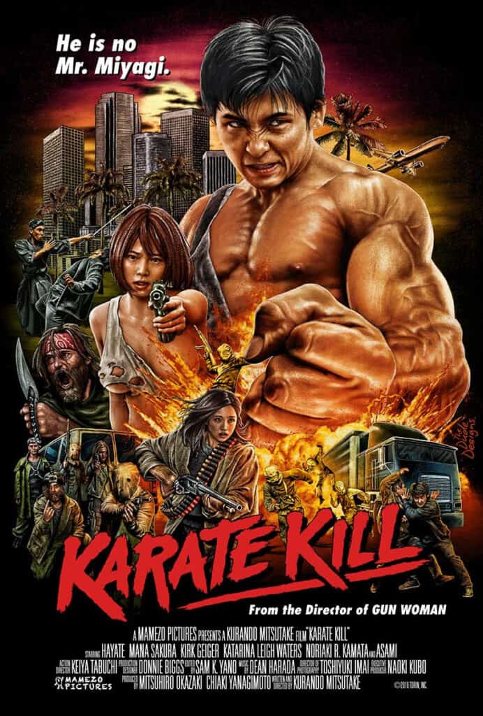
Karate Kill
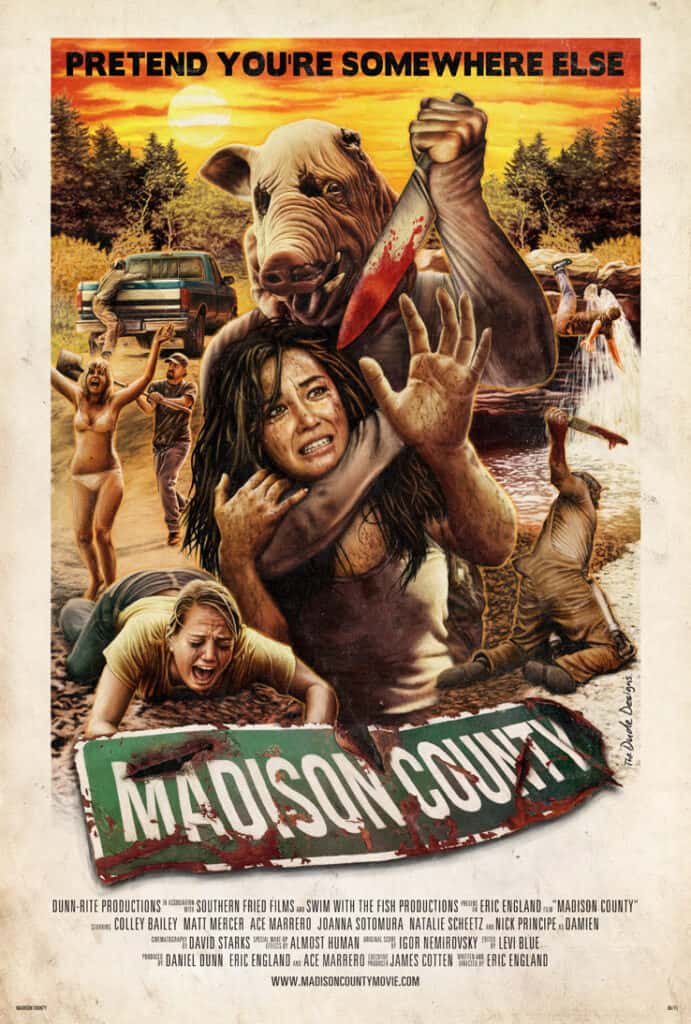
Madison County
New York Ninja
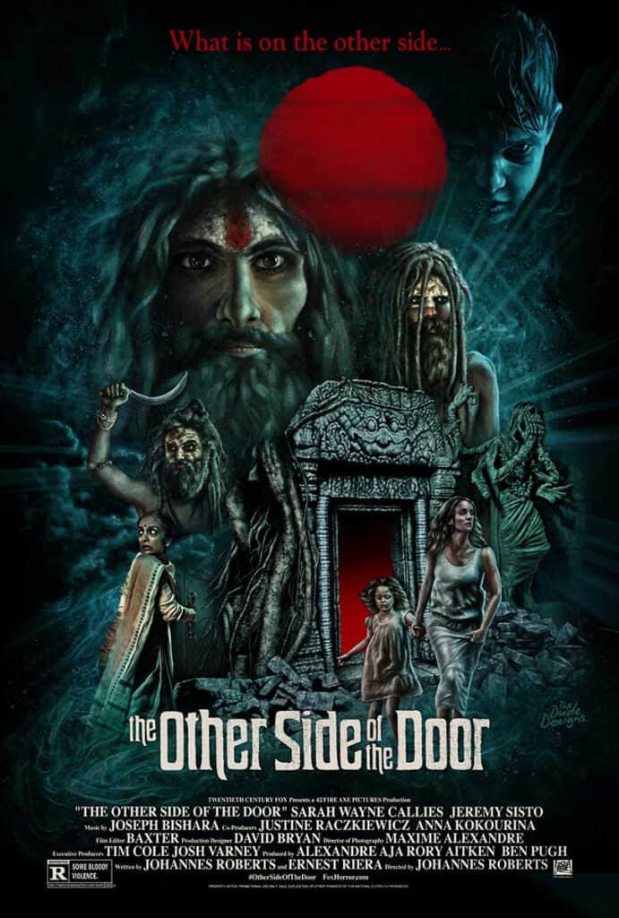
The Other Side Of The Door
The Running Man
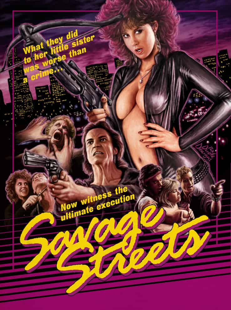
Savage Streets
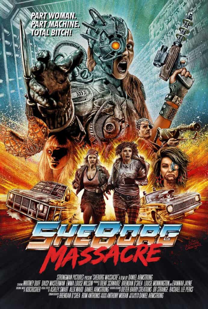
SheBorg Massacre
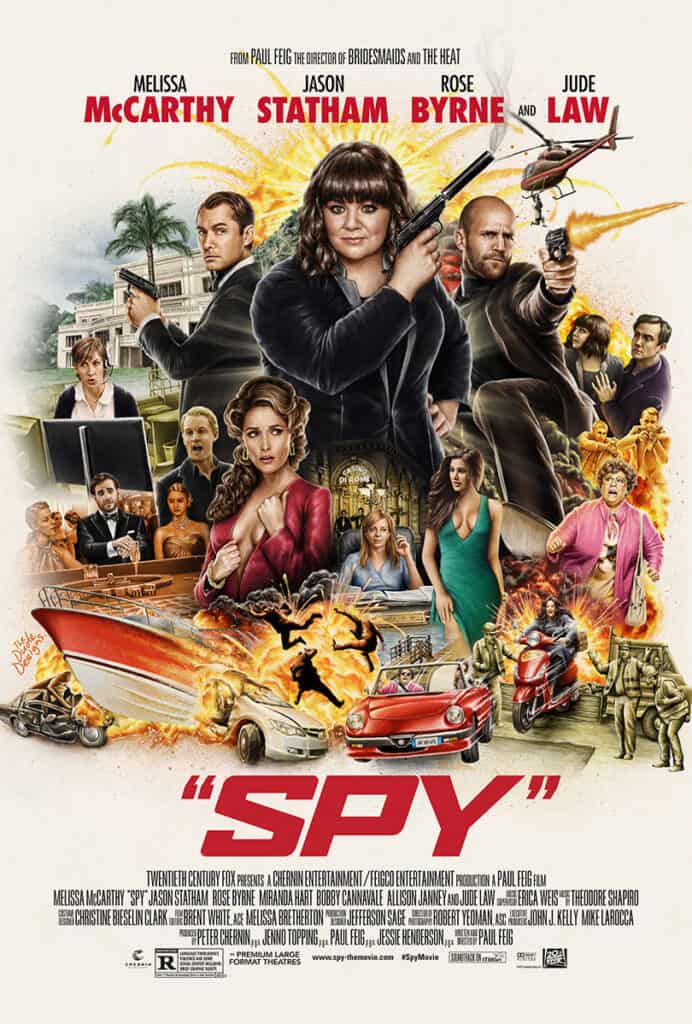
Spy
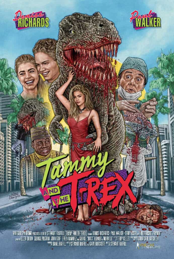
Tammy And The T-Rex
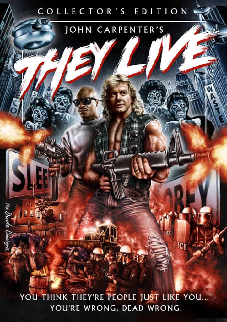
They Live
Tremors
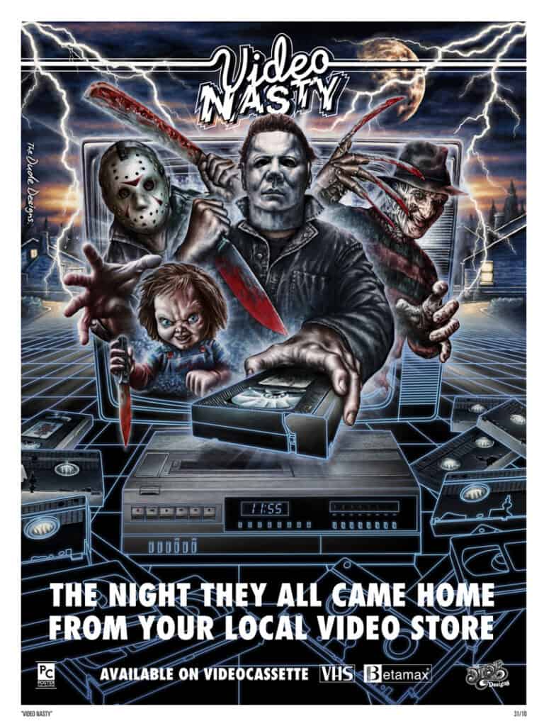
Video Nasty
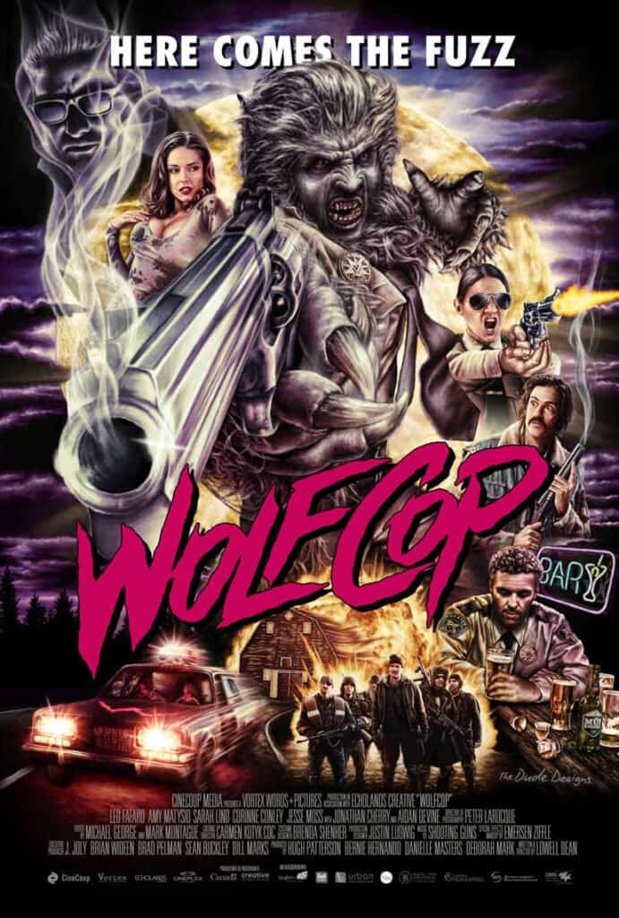
Wolfcop
WrestleMania III
